The Convenience Effect
How Packaging Has Evolved Around the Consumer’s Life
As a consumer, foodie, and designer, one of my greatest interests has always been food and snack packaging. Often, the conversation around packaging centers on graphic design—what makes one design more visually appealing or "sexy" than another. I can relate to this; when I'm shopping for a new product, I naturally gravitate toward the graphics that catch my eye. However, the influence of graphic design on a consumer’s decision ends there. While it certainly plays a role in attracting attention, graphic design is ultimately just ink on material—a relatively inexpensive tool for creating a first impression.
However, in recent years, there have been more trends of convenience in the packaging industry - from kid-sized packaging to condiment tubes that squeeze out both peanut butter and jelly at the same time. At the same time, I have had a lot of instances in my life when I wished something was packaged differently, or was conscious of the context.
Why must I finish an un-resealable pack of trail mix while hiking? And, why is something as simple as a box of crackers, or instant salad packaged a certain way? Furthermore, why have these designs remained stagnant (or reliable) for so many decades?
To learn about this, I started doing a few things:
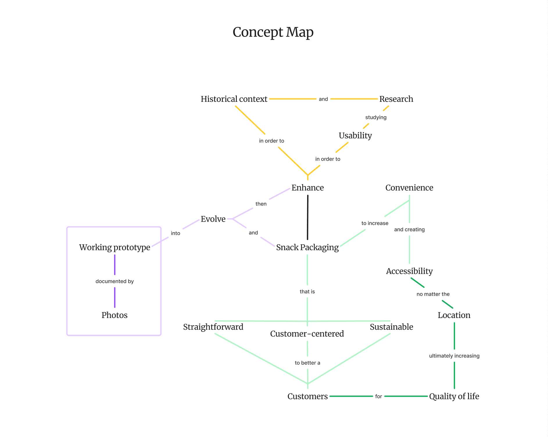
- Collecting data and historical information on packaging innovations and how they shaped the packaging industry, creating a timeline
- Finding/collecting instances of current experience-enhanced packaging (visiting a LOT of grocery stores), noting if there is a “whimsy” or ingenuity in the packaging
- Creating surveys/questionnaires with an expansive demographic (everyone eats, don’t they?) to collect a wide range of pain points and noting down common experiences.
Field Work
In total, six grocery stores were visited, making sure that the selection was diverse enough in products to account for variables like different cultures, price points, and contextual uses (gifts, single-serve packaging, fresh vs. processed, etc). Products were selected on the grounds of consumer experience and packaging for convenience, looking at the combined appeal of those two metrics. Other factors influencing product appeal, such as graphic design, product quantity, and health benefits, are not taken into consideration in product selection. All fresh produce was also excluded from this research, so as to only focus on the appeals with shelf-stable packaging.
The final crucial factor to selecting a product is experiential uniqueness - or how the product fits into the grander scope of similar products categorically in their experience. For example, a family-sized bag containing different chips for individual consumption would be categorically the same as a box of Jell-O cups in the experience they provide - a larger package used for the purposes of carrying smaller packages for individual servings. But how many experience-based categories of products exist? Infinite, perhaps, was my thought at the beginning of this project.
However, when constrained by the aforementioned factors, five categories for experience-based current packaging considerations were determined.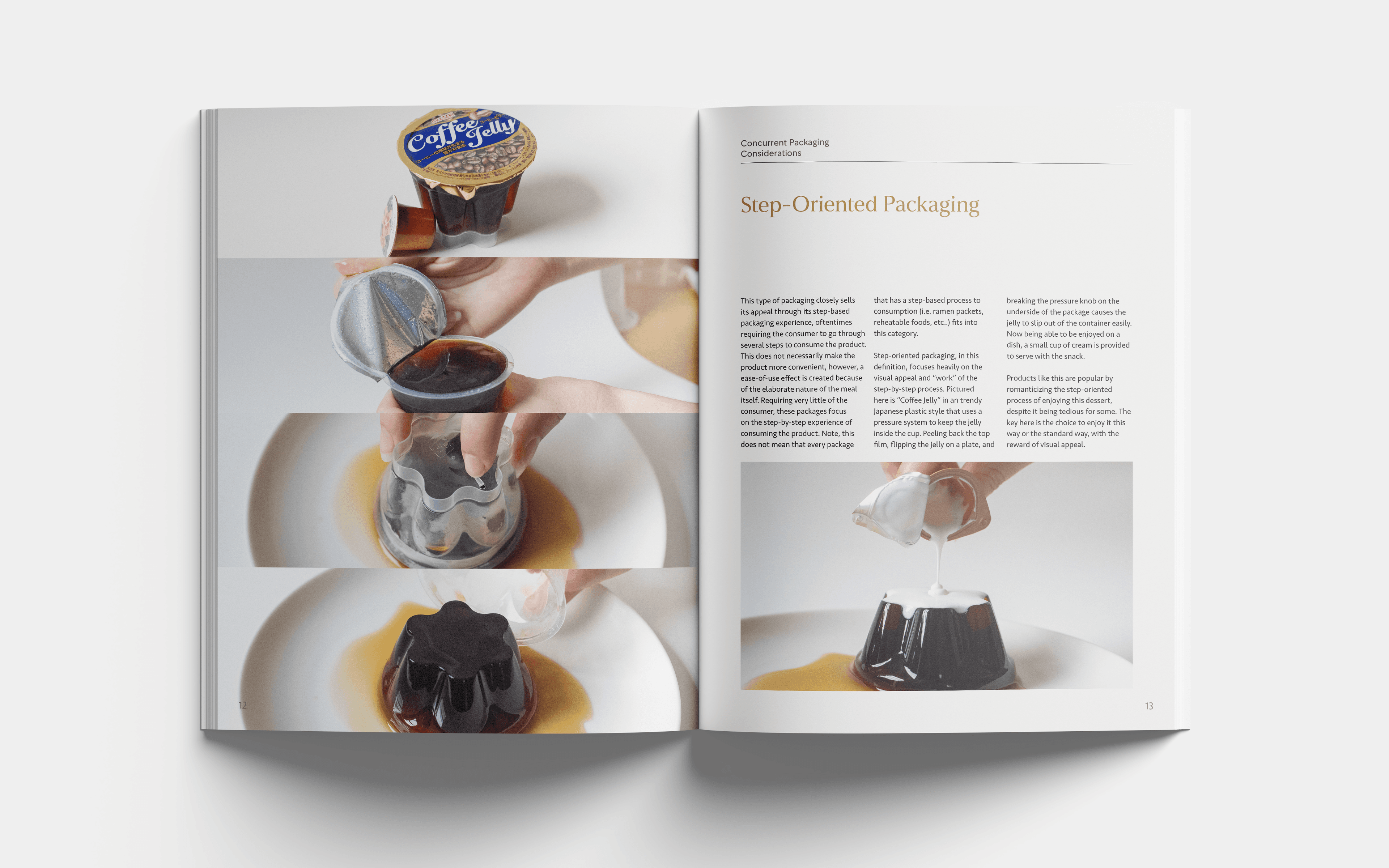
In addition to these discovered categories, an interesting property of a product’s experiential uniqueness is that it is usually correlated with consumer values. We can further study consumer values like family, saving time, tradition, losing weight, or gaining weight on a by-product basis. For this study, I interviewed close friends of mine to understand their relationship to the foods they eat, asking:
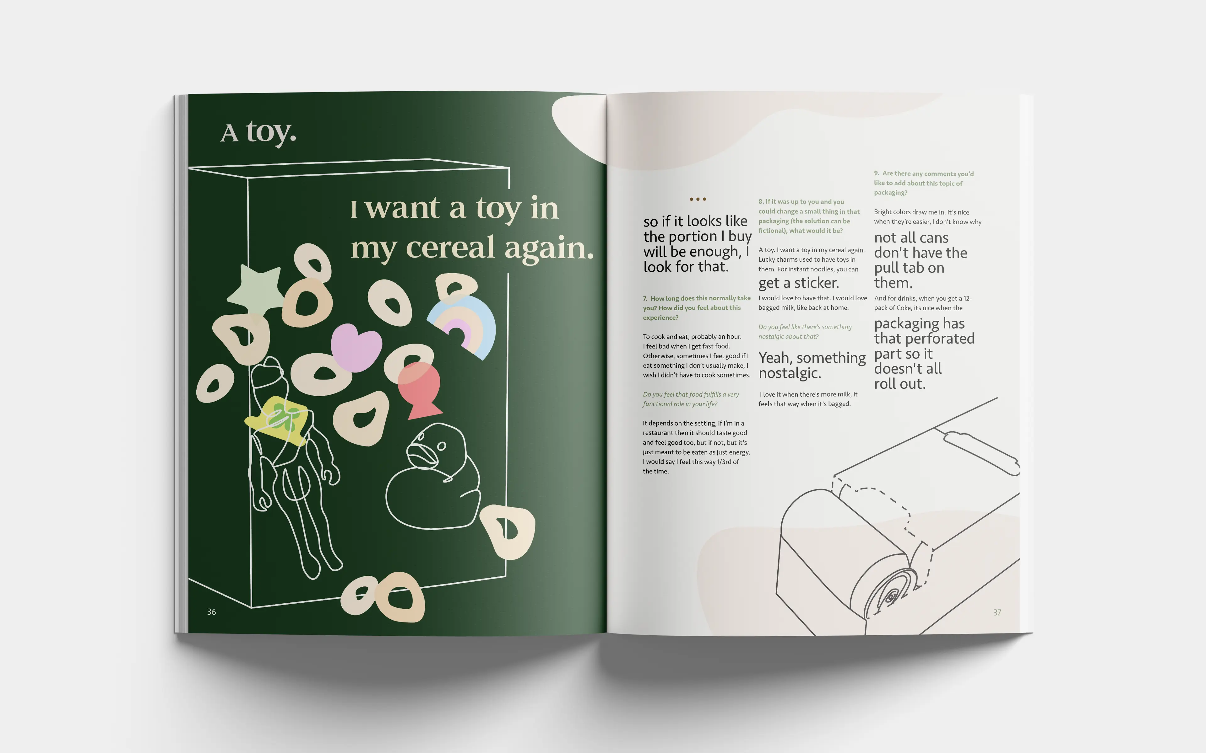
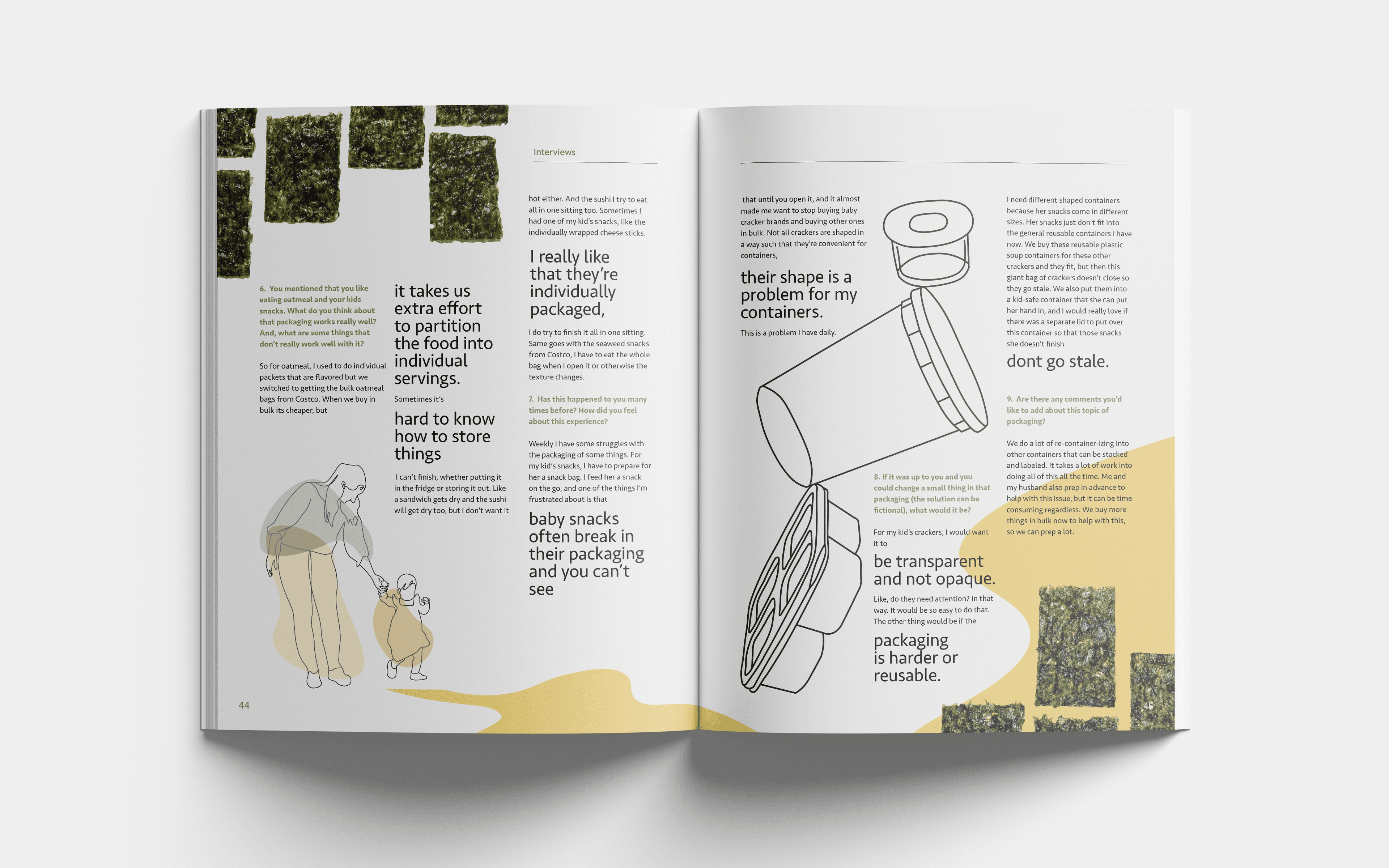
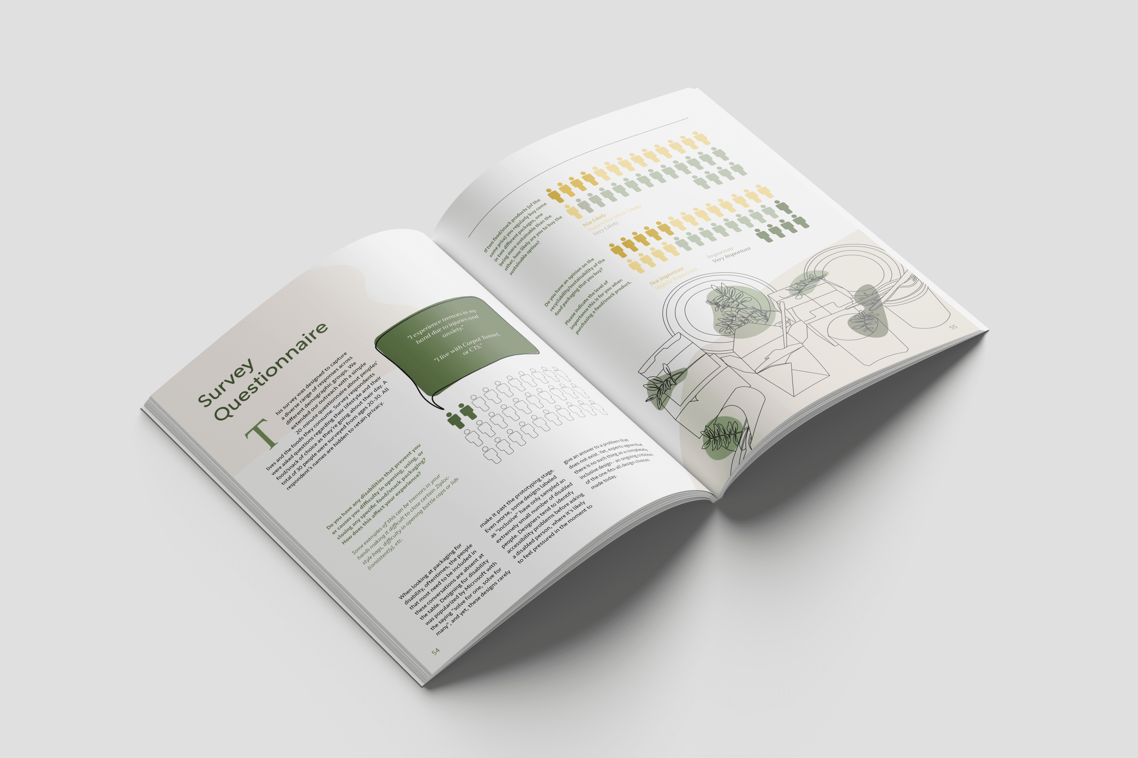
In addition to these interviews, I conducted a grocery store probing exercise with my good friend Ava, where we walked around her local grocery store and she gave me her thoughts on everything she bought - what she liked about the packaging, what she didn’t like, as well as what she wished was different about some of the items she loved. Finally, a questionnaire was completed by thirty participants to understand more general sentiments about the state of packaging, common inconveniences, and increased plastic waste in the United States.
The final crucial factor to selecting a product is experiential uniqueness - or how the product fits into the grander scope of similar products categorically in their experience. For example, a family-sized bag containing different chips for individual consumption would be categorically the same as a box of Jell-O cups in the experience they provide - a larger package used for the purposes of carrying smaller packages for individual servings. But how many experience-based categories of products exist? Infinite, perhaps, was my thought at the beginning of this project.
However, when constrained by the aforementioned factors, five categories for experience-based current packaging considerations were determined.

- Comprehensive Packaging:Packaging that considers all steps of the consumption experience, from opening the package to utilizing any/all components of the package to assemble/prepare the meal, and consuming the meal. One of the most common features of comprehensive packaging is the inclusion of utensils.
- Step-Oriented Packaging:This type of packaging requires the consumer to go through several steps to consume the product, most of the time creating an “ease-of-use” effect. There is a heavy focus on the visual appeal and “work” of the step-by-step process. Where there is satisfaction in going through the steps to achieve an appetizing product, there is experience.
- Tradition-Focused Packaging:There are many foods and snacks in the world that have a specific way they need to be consumed — it wouldn’t do to put them in a box or a bag or serve them with a fork or spoon. Some of the most common reasons are tradition, preservation of quality, or nostalgia. Packages that incorporate the “roots” of a food create trust in the consumer, with some consumers even believing that a food may be higher quality or more authentic when compared to another identical product that may not incorporate these values into their packaging.
- Portion-Controlled Packaging:One of the most common forms of packaging for convenience is packages that save consumers time by not having to take a portion out of a package and place it into another container. Mini packaging exploded in popularity because of the appeal of saving time, helping with meal-prep, portion control, or dieting. Some examples can be Halloween candy, variety chip bags, and more. It is one of the most pervasive forms of packaging because of how inexpensive it is for companies to provide a portion-controlled experience.
- Extended-Purpose Packaging:Packaging that doubles as a tool in function (in addition to being a container for an ingredient/snack) fits in this category. Often, these products will be more expensive because of the reusable nature of the product. Some examples can be yogurt that comes in glass cups, or fruit tarts that come with a ceramic tart pan. Refillable products can also achieve this, like a canister of cocoa powder that has a sieve built-in to dust cocoa over a drink can be used indefinitely.
In addition to these discovered categories, an interesting property of a product’s experiential uniqueness is that it is usually correlated with consumer values. We can further study consumer values like family, saving time, tradition, losing weight, or gaining weight on a by-product basis. For this study, I interviewed close friends of mine to understand their relationship to the foods they eat, asking:
- What sort of inconveniences are a daily occurrence?
- How much of their sustenance comes from disposable and convenient sources?
- What are their personal values, and how do we see that in what they eat?
- What are possible solutions to their inconveniences?


In addition to these interviews, I conducted a grocery store probing exercise with my good friend Ava, where we walked around her local grocery store and she gave me her thoughts on everything she bought - what she liked about the packaging, what she didn’t like, as well as what she wished was different about some of the items she loved. Finally, a questionnaire was completed by thirty participants to understand more general sentiments about the state of packaging, common inconveniences, and increased plastic waste in the United States.
Applicability and Significance
What does this mean for the food and snack packaging industry? This research identifies five strong existing metrics for consumers' heightened packaging experience, and it is easily applicable to improve any existing product as well. For example, let’s improve the experience of a Coca-Cola:
Step-Oriented Packaging doesn’t exactly fit into this product’s journey, as not all categories are applicable all the time to all packages. However, this example crams as many of these categories to be applicable as possible, creating something really wonderful: a case of original Coca-Cola in their glass bottles with a Coca-Cola branded tab opener in the package, made from sustainable materials. Opening this kind of soda with a tab opener can feel pretty satisfying, and even more satisfying to use the same tab opener in other settings. No longer would you have to worry about a tab opener going missing at a party, on a camping trip, or at a BBQ. With one in every package, it’s easy to pass around or pack into luggage, with no hard feelings if it gets lost.
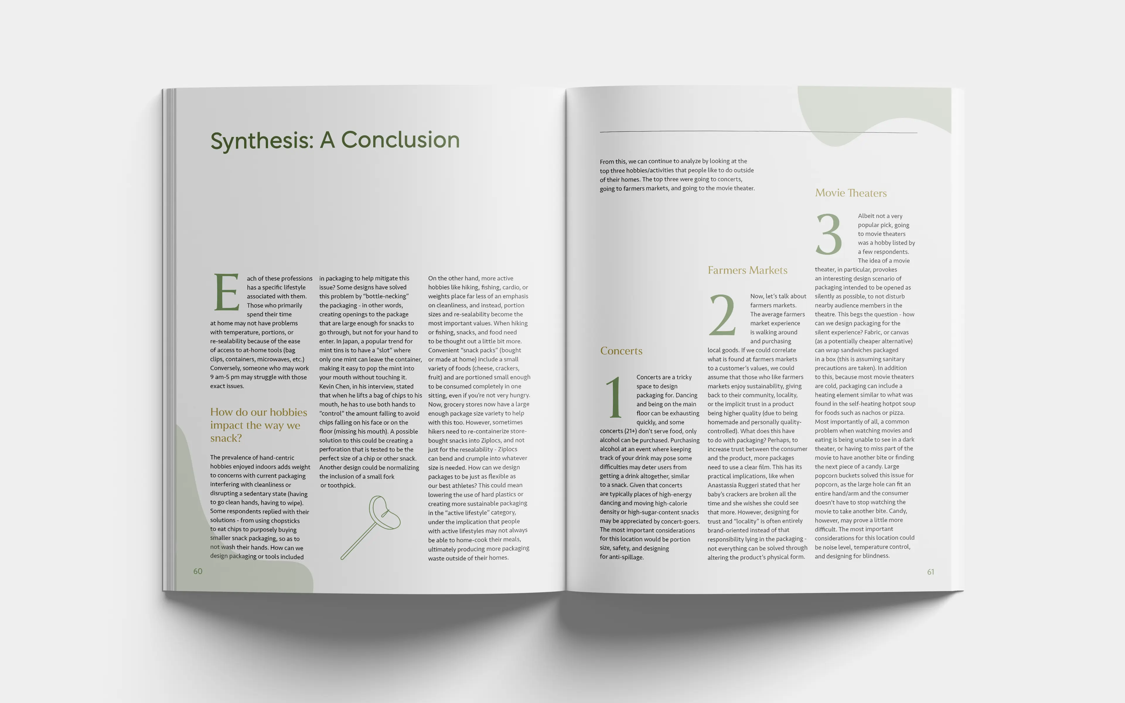
Coming to a conclusion, I looked broadly at all of the data that was gathered over the months of the study. Surveys indicated that the vast majority of respondents enjoy going to concerts, farmers markets, and movie theaters. We can continue exploring solutions for packages that find themselves in these contexts, such as reflective inner packaging for movies (as to see your snack in the dark), or exploring transparent packaging to increase trust between the consumer and the product for those who value the transparency locally-grown foods provide at a farmers market. We can fix staleness, accessibility issues, and one-use plastics with the foods we love by looking for sustainable solutions that make our lives just a little bit easier.
- Tradition-Focused Packaging:Let’s focus on the nostalgia of the product. Who doesn’t love the original, beautiful glass bottles of a Coca-Cola? Let’s bring back that curvy bottle with the metal tab top.
- Portion-Controlled Packaging:Coca-Cola is already portion-controlled if every bottle is one serving, but this category also includes bundles of single portions. Let this product be a pack of six bottles in a case made with sustainable material.
- Comprehensive Packaging:How are we going to open our original metal tab top without a tab opener? A branded tab opener can be included in the case, made from recyclable material. As a crazy idea, it can even be incorporated into the soda case itself.
- Extended-Purpose Packaging:By including a tab opener, consumers can use the tab opener in other parts of their lives to open other bottles, as an extension of the tab opener’s purpose and lifespan.
Step-Oriented Packaging doesn’t exactly fit into this product’s journey, as not all categories are applicable all the time to all packages. However, this example crams as many of these categories to be applicable as possible, creating something really wonderful: a case of original Coca-Cola in their glass bottles with a Coca-Cola branded tab opener in the package, made from sustainable materials. Opening this kind of soda with a tab opener can feel pretty satisfying, and even more satisfying to use the same tab opener in other settings. No longer would you have to worry about a tab opener going missing at a party, on a camping trip, or at a BBQ. With one in every package, it’s easy to pass around or pack into luggage, with no hard feelings if it gets lost.
Coming to a conclusion, I looked broadly at all of the data that was gathered over the months of the study. Surveys indicated that the vast majority of respondents enjoy going to concerts, farmers markets, and movie theaters. We can continue exploring solutions for packages that find themselves in these contexts, such as reflective inner packaging for movies (as to see your snack in the dark), or exploring transparent packaging to increase trust between the consumer and the product for those who value the transparency locally-grown foods provide at a farmers market. We can fix staleness, accessibility issues, and one-use plastics with the foods we love by looking for sustainable solutions that make our lives just a little bit easier.
The full magazine, digital or print, is available upon request. Please send any inquiries to arzumanovavictoria(at)gmail.com.